Связаться с нами
Перед началом работы нам необходимо обсудить детали. Расскажите нам о своем проекте и укажите ваши контактные данные. Мы обязательно свяжемся с вами!
Нажимая кнопку «Отправить заявку», вы соглашаетесь на обработку персональных данных и с политикой конфиденциальности.


Click: when a financial assistant got cooler
For more than 10 years, Click has helped people manage their money with ease and confidence. The company grew from a startup into a major tech player, and by then it needed a refresh.
Our task was to help Click shape its positioning strategy, build a scalable brand identity that reflects its current strength and ambition, and prepare the brand to become a super app.
The transformation is grounded in a philosophy that inspires, energizes and makes clear that Click has grown from a local brand into a serious player with global ambitions. We started with in-depth analysis: we studied trends, gathered audience feedback and audited the brand. This showed us what Click needed to become to meet today’s market expectations.
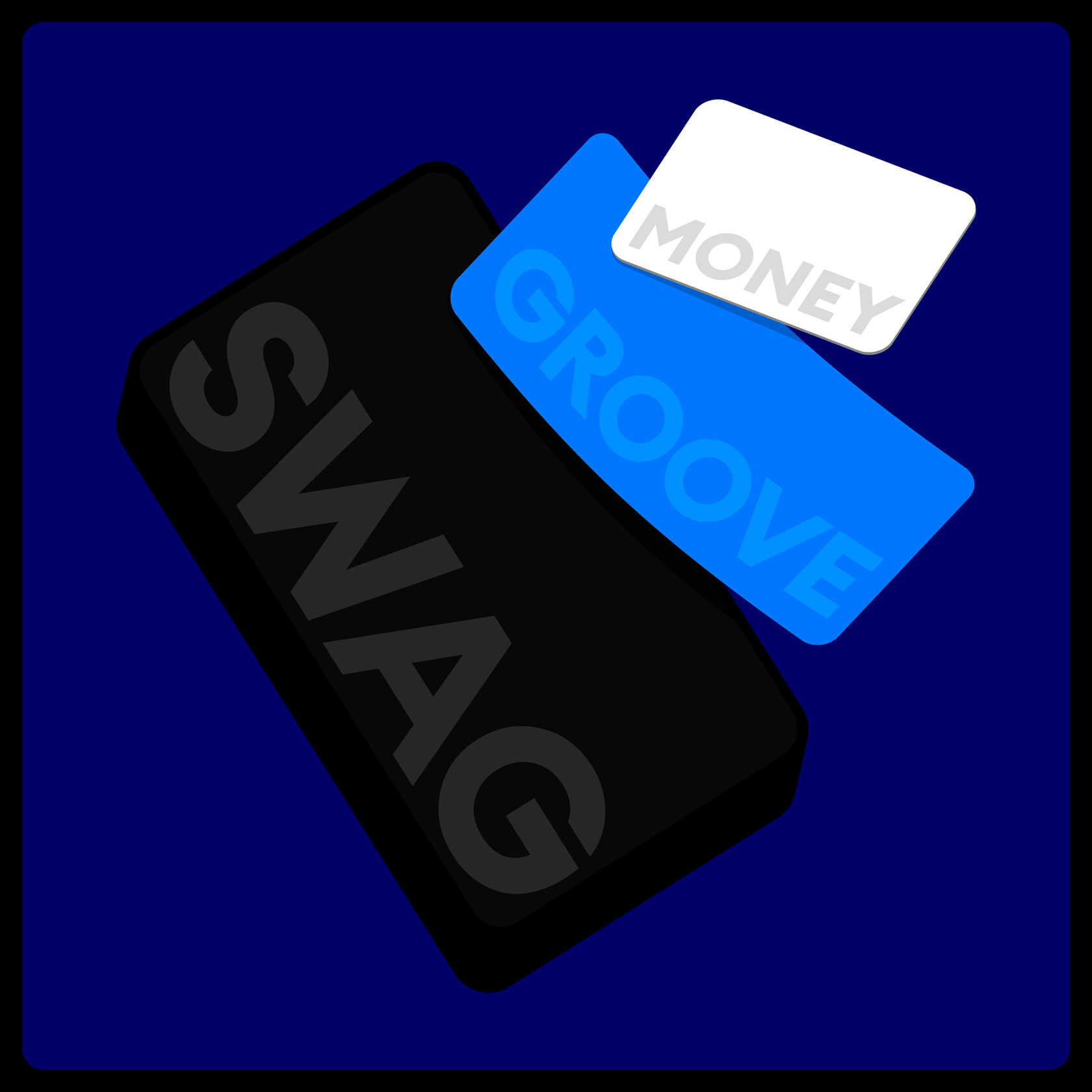
That is how the big brand idea was born: “Swag the money.” It captures Click’s energetic, ambitious character and turns dealing with money into easy, enjoyable moments. “Swag the money” is about swagger, freedom and drive, qualities people now associate with the brand. Its simplicity makes the idea powerful and easy to scale.
Click’s new identity brings together boldness, ambition and readiness to scale. Given the range of products, divisions and future business lines, we built a flexible, structured brand architecture that sets the style for future identities and new services.
The update started with the logo. We built on its earlier forms but made it cleaner, sturdier and stronger. The logo now embodies the idea of “make it BOLD”: powerful, recognizable and a sign of the company’s confidence. The color palette was refreshed as well. It keeps a link to the past but is brighter and higher in contrast, conveying dynamism and energy.
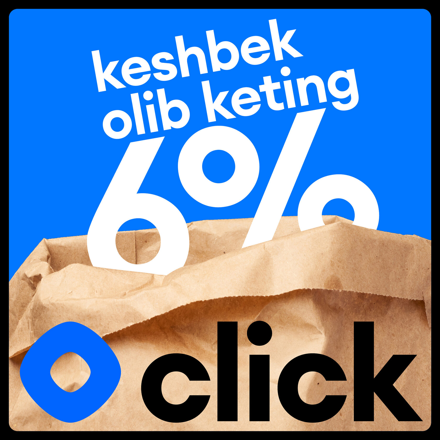
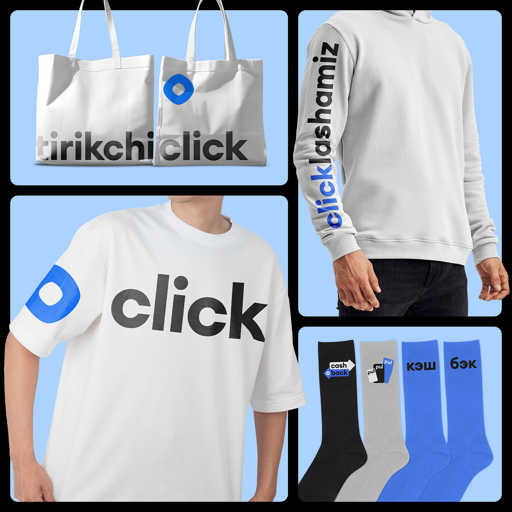
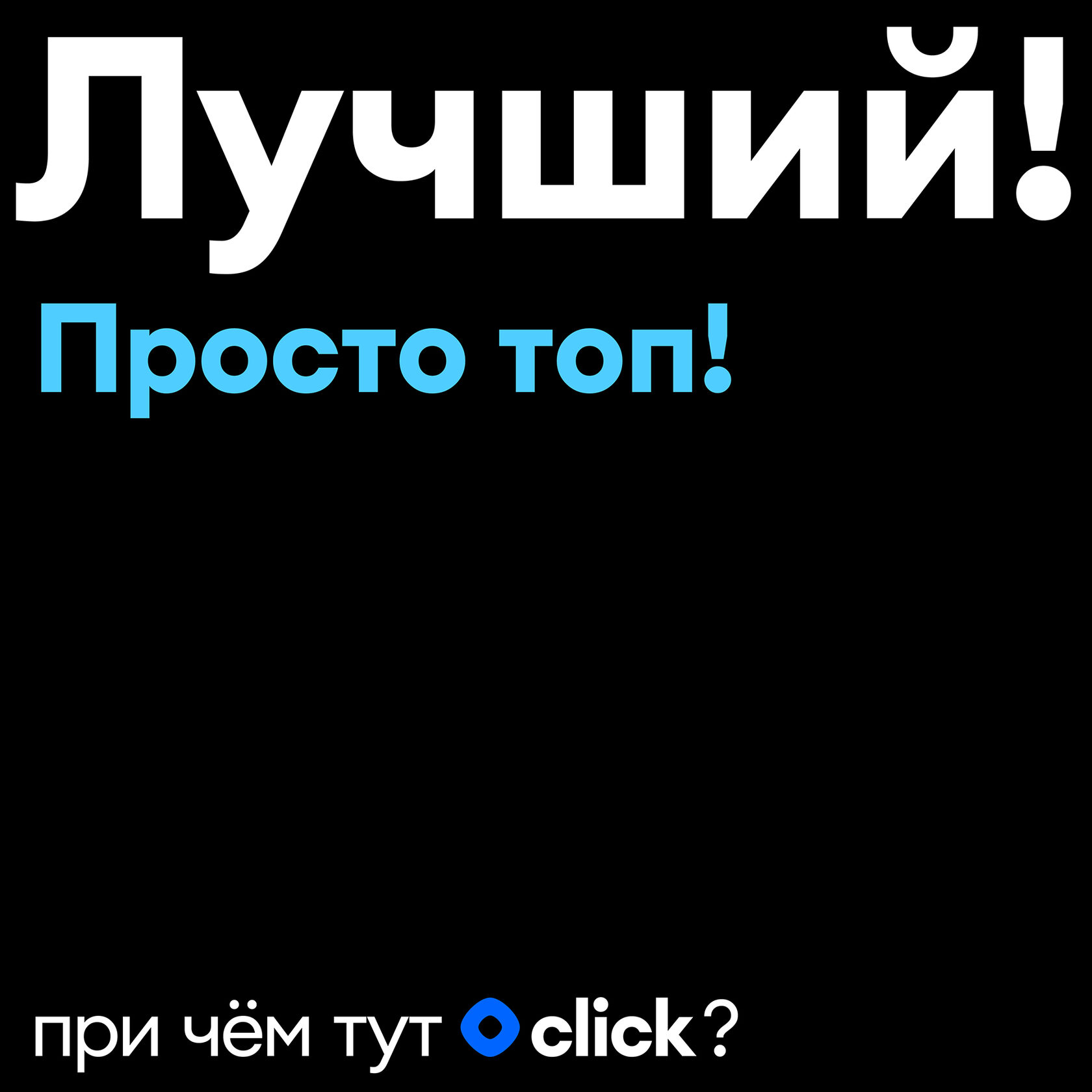
Typography, tone of voice and copy became key expressions of the brand’s spirit. Daring slogans and emotive portraits in the photography brought the brand closer to its audience and gave it a character of its own. We added gestures that signal self-expression and swagger, and they became part of the brand’s visual language.
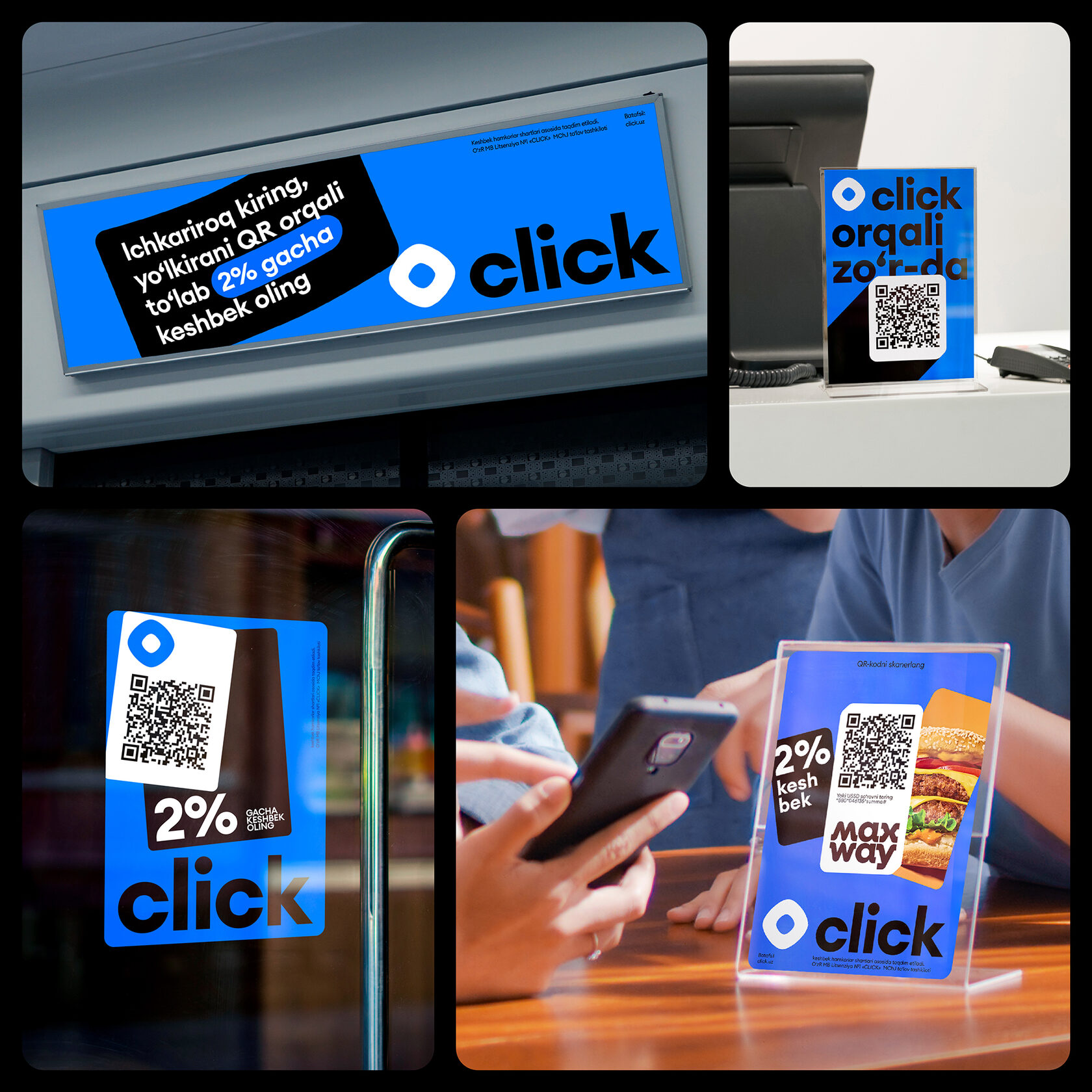
Beyond a logo and colors, Click’s identity is a complete system of dynamic typography, patterns, active imagery and daring communication. We also structured and visualized the brand architecture, designing product logos and setting the style for every future business line.
Related work