Связаться с нами
Перед началом работы нам необходимо обсудить детали. Расскажите нам о своем проекте и укажите ваши контактные данные. Мы обязательно свяжемся с вами!
Нажимая кнопку «Отправить заявку», вы соглашаетесь на обработку персональных данных и с политикой конфиденциальности.


Uzbek orchards and traditions in modern branding
Frutystan is a full-cycle Uzbek company working in horticulture, consulting, exports and the development of fruit tree nurseries. Its focus is B2B: large wholesalers, suppliers and farmers, with markets in Southeast Asia, the Arab world and Russia.
Our task was to develop the name and visual identity. They had to convey the high standard of the produce, highlight the link to Uzbekistan as a country with a rich fruit-growing tradition, and make the brand recognizable in international markets.
We settled on the name Frutystan. It reflects the company’s horticultural and farming role, and the suffix “-stan” recalls Uzbekistan. The name is versatile and easy to remember in local and international markets alike. This way, the name alone ties the company to the image of a land of fruit.
We took the same approach to the identity, combining different images to build the right associations with the company. Nature motifs, birds of paradise and a rich palette together create a feeling of summer harmony, joy and ripe fruit.
We took the same approach to the identity, combining different images to build the right associations with the company. Nature motifs, birds of paradise and a rich palette together create a feeling of summer harmony, joy and ripe fruit.
The Frutystan concept rests on a philosophy of combining the best of tradition with modern technology. The visual identity is designed to show the company’s consistent quality and innovative approach. It pairs locally recognizable elements with universal symbols that global markets understand. Bright, emotional and authentic, the identity helps Frutystan stand out from competitors and earn the trust of its partners and clients.
The Frutystan logo is built on symbols that capture the essence of the brand. The Humo bird, a national symbol of Uzbekistan, embodies harmony and growth and represents the link to the region’s culture. The ripe fruit is a bright accent that draws attention to the freshness and quality of the produce. The gardener’s hand stands for care, skill and commitment to high standards.
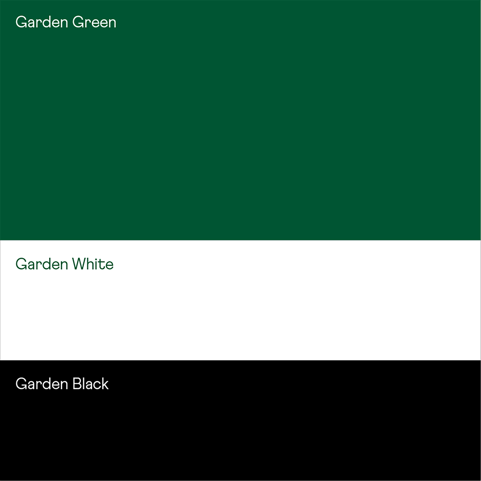
The color palette evokes warmth, trust and naturalness. Typography with rounded forms makes the brand softer and more contemporary, giving it an appealing, friendly look.
Related work