Связаться с нами
Перед началом работы нам необходимо обсудить детали. Расскажите нам о своем проекте и укажите ваши контактные данные. Мы обязательно свяжемся с вами!
Нажимая кнопку «Отправить заявку», вы соглашаетесь на обработку персональных данных и с политикой конфиденциальности.


The warmth of family traditions in a modern visual identity
Safia is a chain of bakery cafés that grew from a small family pastry shop into a network with branches in several cities in Uzbekistan and Kazakhstan. Although it was well known and much loved, the brand needed a refresh that would keep its unique character and strengthen its bond with customers.
Our task was to create a new visual image that would blend the brand’s history, care and family spirit with contemporary trends and ambitions.
Safia is a brand with warm family values and a warm atmosphere. Ask what people associated with the Safia bakery cafés at the time, and several things would come to mind, but one of the first would be the brand’s much-loved mascot, a curious little girl named Safia.
It is no secret that she was inspired by the founder’s granddaughter and niece. Safia appears in the chain’s logo and other applications as well as in the logos of the brand’s subsidiaries, so we had to modernize her image and also develop many adaptations for different situations.
A sweet, partly magical character runs through both the visual style and the mascot herself. She needed to evolve to match the brand’s current positioning. Our design team tried many variations, and in the end the soft watercolor Safia grew up, becoming brighter and more modern, just like the company.
We also revisited the custom lettering and typography of the logo, making them denser and richer to complement the updated mascot.
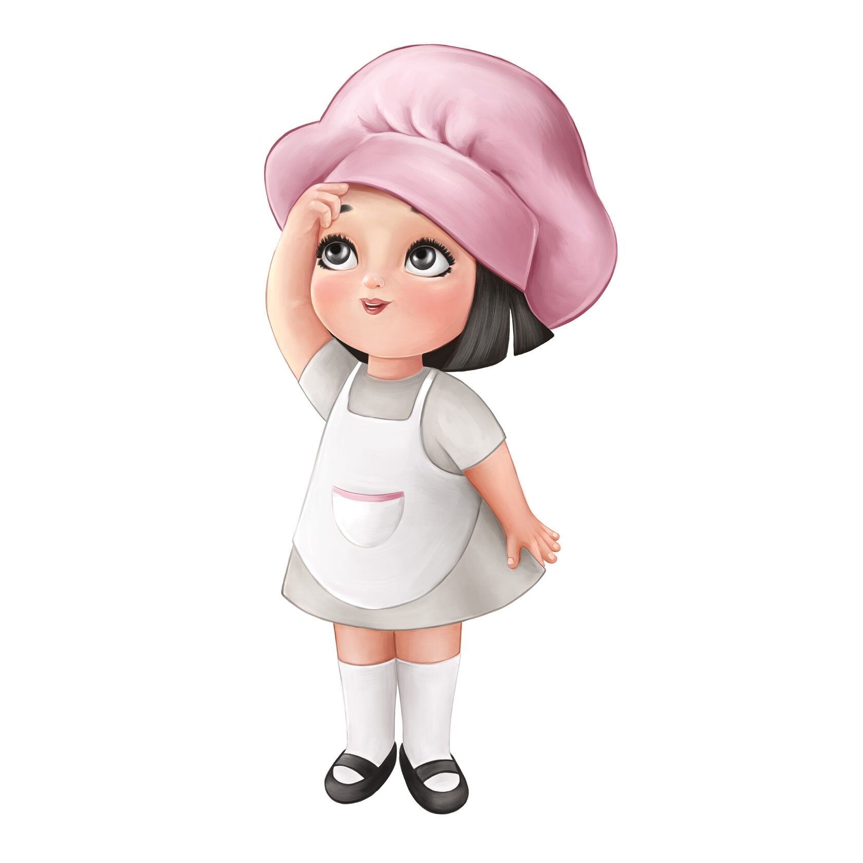
We drew every scene featuring Safia by hand, along with the lettering. It was a long but fascinating process, which is why we feel joy and pride every time we see Safia around the city.
Before working on the system of brand elements for the Safia bakery cafés, we ran a design audit and studied the brand’s visual language as it stood. The watercolor illustration style chosen originally is especially common in the pastry business.
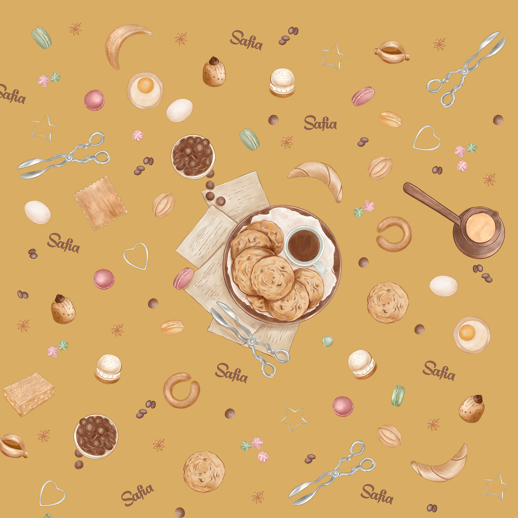
Watercolor conveys a handmade quality and the very tenderness and sweetness most pastry shops rely on. So our task was to develop new tools that grew out of the previous style and would help create the right character for the renewed brand.
We expanded the system of brand elements with hand-drawn food patterns, developed rules for typography across applications, and created a system of wayfinding and packaging elements for retail. Our main criterion was to keep the brand’s visual image recognizable while renewing it carefully and organically. All of this gave the brand more depth and range.
The renewed Safia identity is deeper and more multifaceted, keeping its warmth while gaining a contemporary edge. The brand now lives naturally across every touchpoint, from café signage to packaging, and continues to delight customers.
Related work