Связаться с нами
Перед началом работы нам необходимо обсудить детали. Расскажите нам о своем проекте и укажите ваши контактные данные. Мы обязательно свяжемся с вами!
Нажимая кнопку «Отправить заявку», вы соглашаетесь на обработку персональных данных и с политикой конфиденциальности.


Fast. Affordable. Fresh.
Our task was to create a complete design system for Fretta, including the identity, packaging and store exteriors. The visual language had to scale easily, work in a busy urban environment and reflect the brand’s core values: speed, affordability and freshness.
Fretta is a chain of city coffee shops whose name is Italian for “hurry.” The aim was to be a place where anyone can grab a bite, especially near office buildings and busy parts of the city. The format means fast service, a straightforward product and clear communication.
The visual system is built on simplicity and energy. A bright orange helps the shops stand out on the street and reinforces associations with vitality and movement.
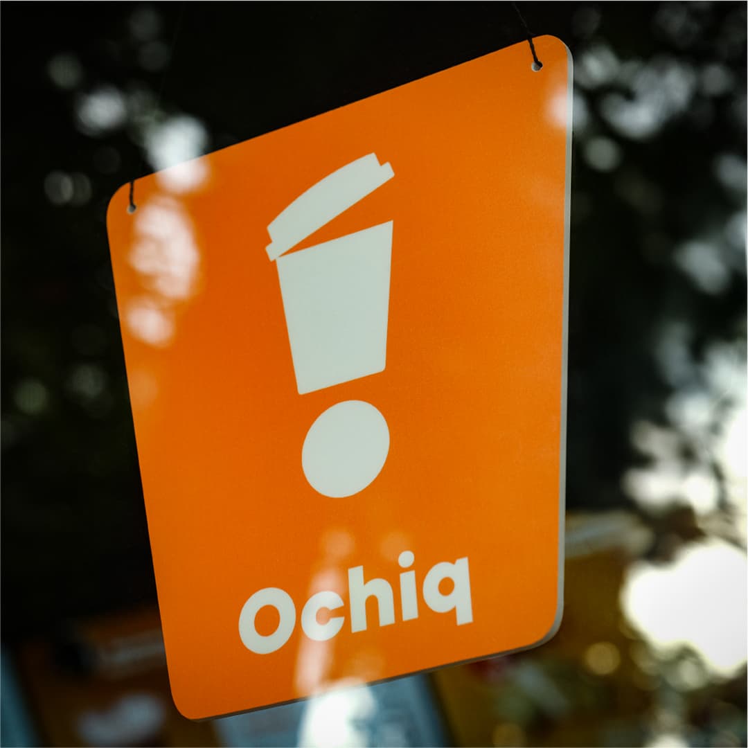
The logo is an exclamation mark with a coffee cup as its vertical stroke: a symbol of momentum, a signal, the start of the day.
The design system covers everything from packaging and wayfinding to facades. It is flexible and concise and adapts easily to different store formats, keeping the brand consistent and recognizable in any location.
Related work