Связаться с нами
Перед началом работы нам необходимо обсудить детали. Расскажите нам о своем проекте и укажите ваши контактные данные. Мы обязательно свяжемся с вами!
Нажимая кнопку «Отправить заявку», вы соглашаетесь на обработку персональных данных и с политикой конфиденциальности.


An identity for Air Samarkand that brings the imagery of Samarkand to a modern airline
Air Samarkand is a new airline that presents Samarkand as a center of hospitality and cultural heritage. The company aims to deliver the highest level of service and become a leader in the region’s aviation industry, offering travelers an experience that combines tradition and modernity.
Our task was to create a visual identity that reflects Samarkand’s cultural codes, conveys the spirit of the city and supports the airline’s high standards. The main challenge was to unite historical heritage and contemporary trends in a design system that will stay relevant for years to come.
We developed a flexible visual system based on the cultural symbols and archetypes of Samarkand. The main idea was to express the link with tradition through design details and elements, creating a recognizable brand image.
The concept rests on two key symbols: the winged snow leopard, which stands for strength and protection, and the eight-pointed star, which reflects the balance between history and modernity.
The concept rests on two key symbols: the winged snow leopard, which stands for strength and protection, and the eight-pointed star, which reflects the balance between history and modernity.
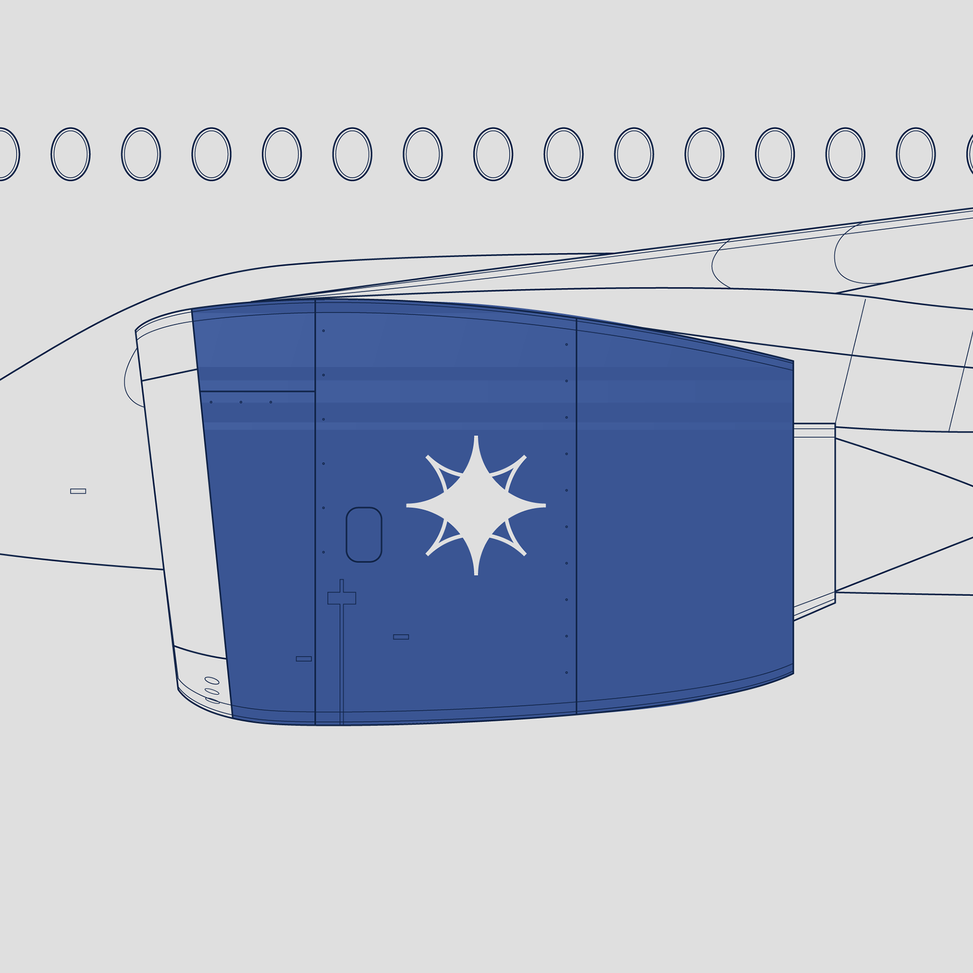
The identity includes many elements, from the logo to a system for all brand applications. For an airline, the most important canvas for the visual identity is the aircraft itself, so we paid special attention to the livery on the tail. There we placed the winged snow leopard against the brand blue, emphasizing the connection with the sky and the airline’s status.
The design also features graphic elements inspired by the eight-pointed star. The livery not only catches the eye at airports but also becomes a symbol of Samarkand hospitality, combining tradition with a modern approach to passenger comfort and care.
The design also features graphic elements inspired by the eight-pointed star. The livery not only catches the eye at airports but also becomes a symbol of Samarkand hospitality, combining tradition with a modern approach to passenger comfort and care.
The logo is an elegant combination of lines and proportions with an Eastern character and a modern edge. It features an eight-pointed star that recalls a compass rose and echoes the city’s architecture. The second key symbol is the winged snow leopard, a mythical guardian and symbol of strength that appears on Samarkand’s coat of arms.
The main brand colors, blue and sand, evoke the sky and the grandeur of Samarkand’s architecture. Blue stands for reliability, stability and altitude, while sandy tones add warmth and hospitality. These colors are used with brand patterns based on the eight-pointed star, an important element of the region’s cultural heritage.
The Air Samarkand identity includes brand patterns and flowing lines that create a sense of lightness and comfort. Every element, from typography to packaging, expresses the brand’s personality and fits its overall concept. The emphasis is on flexibility: the winged leopard appears in profile on the tail and as a full figure on other applications.
Related work