Связаться с нами
Перед началом работы нам необходимо обсудить детали. Расскажите нам о своем проекте и укажите ваши контактные данные. Мы обязательно свяжемся с вами!
Нажимая кнопку «Отправить заявку», вы соглашаетесь на обработку персональных данных и с политикой конфиденциальности.


Özwell: a new brand for your best self
NUMA, one of the leaders of Uzbekistan’s wellness industry, came to us for a complete rebrand, including brand architecture, renaming and a new brand identity. For more than 10 years NUMA had been producing dietary supplements, health foods and cosmetics, and it was preparing for a major expansion. Its plans included new business lines such as medical laboratories, children’s products, sports nutrition and a chain of healthy restaurants.
Our task was to create a modern, versatile brand that would bring all current and future sub-brands together in one system. The new identity had to reflect the diversity of the company’s activities and give all its business lines visual and conceptual coherence, making the brand easy and efficient to manage.
Extensive research led to the central idea of the new brand, a philosophy we called “A better version of yourself.” We wanted to convey the positive image of a local, technology-driven company that inspires people to grow both physically and mentally.
The brand platform is built on the principle of 360° self-care, bringing products, services and educational content together in a single ecosystem. Customers do more than buy products: they become part of a system that helps them improve their quality of life and find harmony.
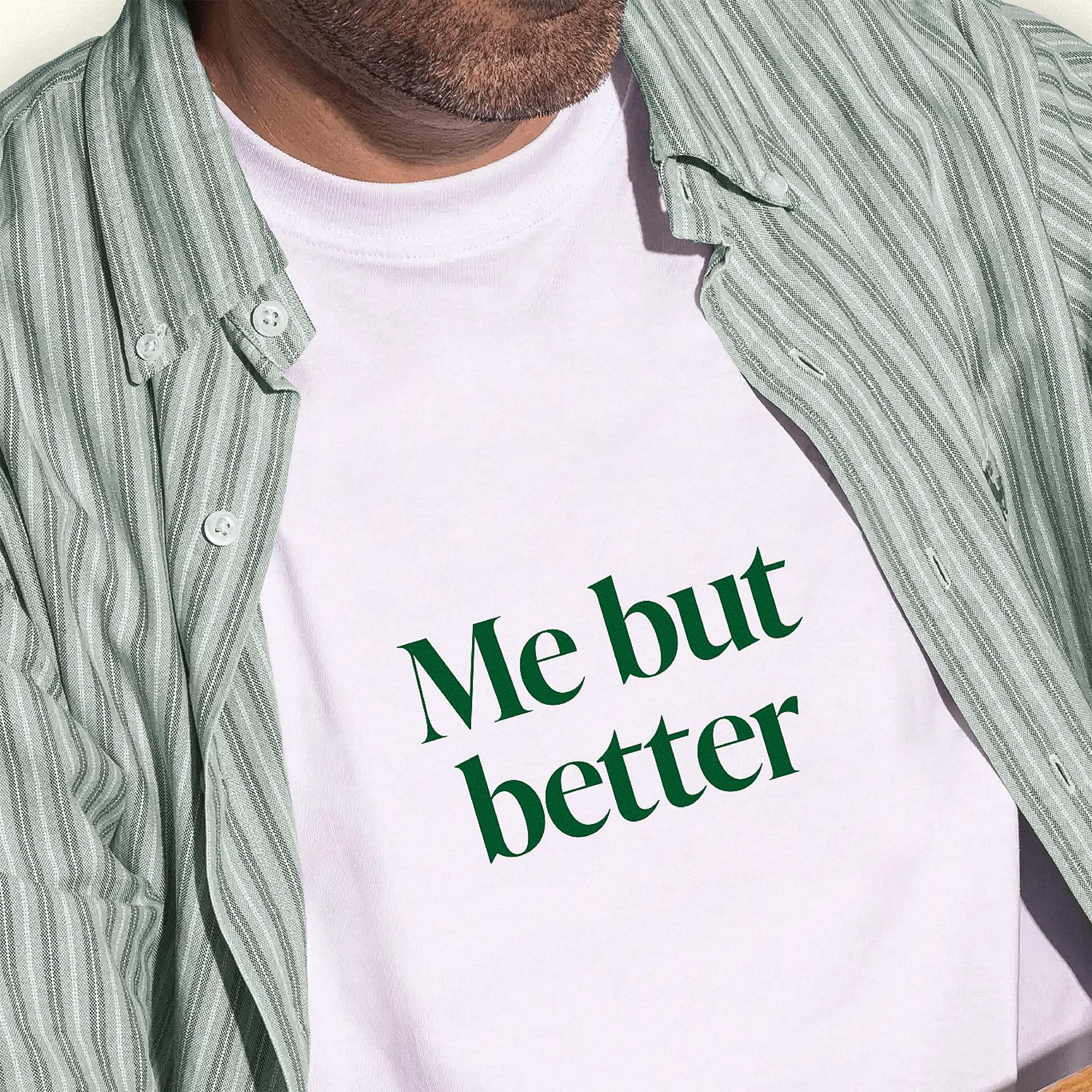
Özwell is positioned as a reliable, technology-driven partner offering safe, natural, certified products made on a “farm to shelf” principle. This approach builds trust, sets the company apart from competitors and makes it a leader of the region’s wellness industry.
Because the name NUMA no longer reflected the new positioning and essence of the brand, we proposed a rename. From a long list of options, Özwell was chosen. It combines two layers of meaning: the Uzbek word “o‘zlik,” meaning “self,” and the English “well.” Together they make a resonant, concise brand name that conveys harmony with yourself and care for your health.
The name feels modern and minimal: easy on the ear and easy to read and spell in many languages. It works in the local market thanks to its structure and the culturally familiar “oz,” and internationally thanks to its universal meaning and sound.
The Özwell visual identity emphasizes modernity, minimalism and a connection to nature. In the logo, a tilde over the “O” symbolizes growth and natural development, while a palette of rich greens and neutrals reinforces associations with health and sustainability. The typefaces and graphic elements balance professionalism and approachability, creating a coherent brand image.
Beyond the brand identity, we designed the retail space for Özwell’s first physical store. This helped the company move offline successfully, present the brand in new formats and express the “A better version of yourself” philosophy at every customer touchpoint.
The rebrand allowed Özwell to redefine its place in the market. The new visual identity strengthened its image as an innovative, caring and reliable partner, helping it attract its target audience and build lasting loyalty.
The company now has a tool to engage customers effectively and inspire them on the path to their best selves.
Related work