Связаться с нами
Перед началом работы нам необходимо обсудить детали. Расскажите нам о своем проекте и укажите ваши контактные данные. Мы обязательно свяжемся с вами!
Нажимая кнопку «Отправить заявку», вы соглашаетесь на обработку персональных данных и с политикой конфиденциальности.


Renewing tradition, shaping the modern
Agro Bravo, a well-known dairy producer from Samarkand, asked us to redesign its product packaging. The brand already had an established audience, but as the range grew and it entered new markets, it became clear that the visual style needed updating. The brand wanted to keep its identity while making the packaging more relevant, more visible and easier to recognize.
Our task was to improve the look of the packaging and also to create a universal system that would work for more than 15 products. It was important to keep continuity with the previous designs while making the packs feel modern and appealing to consumers.
To combine tradition and modernity, we focused on preserving the key elements of the brand’s visual identity while bringing the packaging in line with current trends. We aimed for packs that were bright but free of clutter, eye-catching without adding to the chaos on the shelf.
The main goal was to make the packaging more visible and attractive, and also easy for consumers to understand. We chose contrasting background colors, which set each product in the range apart while keeping a single visual structure.
We also decided the packaging should clearly convey the character and qualities of the products, with an emphasis on clean, natural ingredients. This idea became the foundation of the overall design approach.
We also decided the packaging should clearly convey the character and qualities of the products, with an emphasis on clean, natural ingredients. This idea became the foundation of the overall design approach.
We removed the decorative elements that cluttered the packaging but kept the ones that made the brand recognizable on the shelf. Contrasting background colors made each product easy to spot while maintaining continuity with the previous packs. A diagonal split in the background ties the whole range together, and the food zones were tailored to each product, making the packs both functional and appealing.
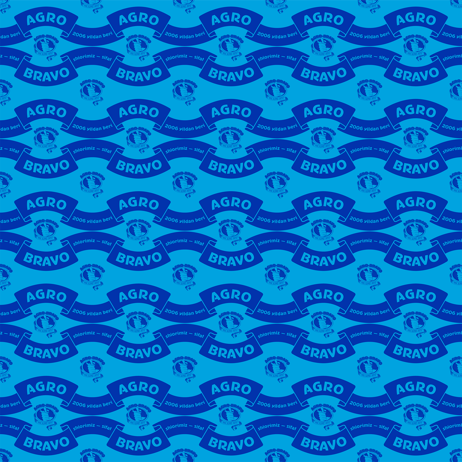
A new seal signifying clean ingredients became an important unifying element, highlighting the products’ naturalness and high quality. The Agro Bravo logo remained recognizable, preserving the link to the past and customers’ trust, while the new elements made the packaging more modern and vibrant.
The redesigned packaging strikes a successful balance between tradition and innovation, improving how the products look and emphasizing their high quality.
Related work